Trivago Rebrand
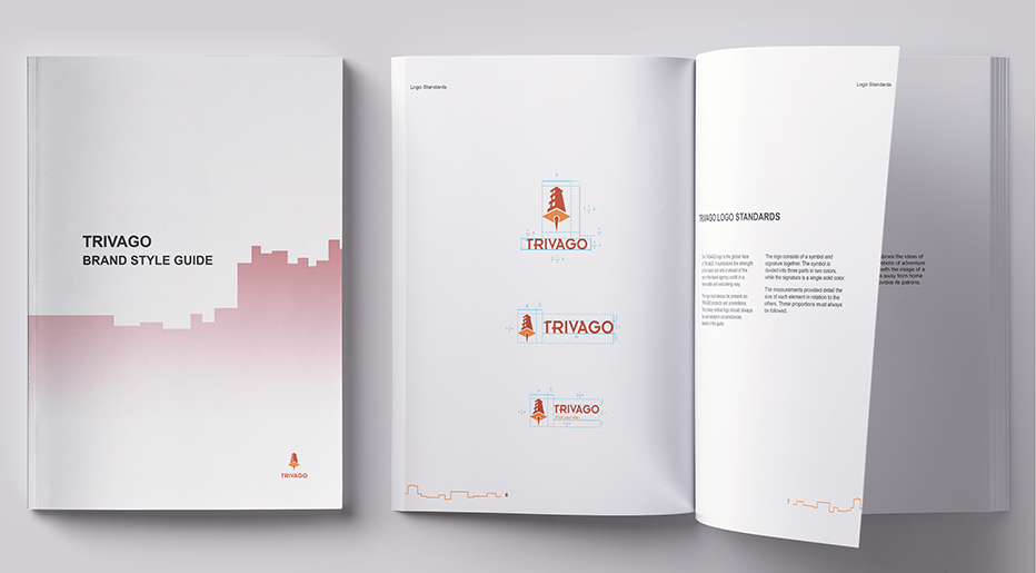
The purpose of this study was to find a brand that could be improved upon--one we percieved as having some sort of problem that could be fixed through design. Over the course of a semester I chose to redesign the Trivago brand beginning with the logo and developing further branding from there.
The problem with Trivago is its vague advertising and branding. The company has an established look unlike other similar hotel search engines. The tricolor scheme of blue, orange, and red is unlike their competetors, but they lack a standalone logo to represent the brand at a glance around the world regardless of the language one speaks. Additionally, the name "Trivago" is not an easily identifiable word, and rather than clarifying its meaning the company promotes the ambiguity through a series of images claiming "Trivago means relax" and other words in various languages. My purpose then was to create a strong, identifiable brand that would be recognizable and set Trivago apart.
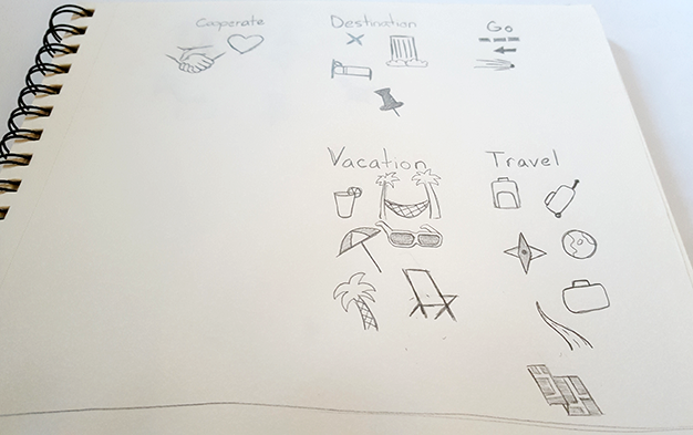
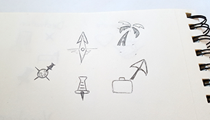
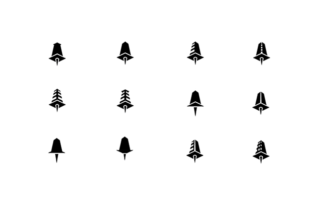
Redesigning the Logo
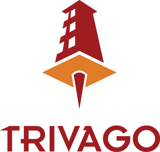
Final Logo
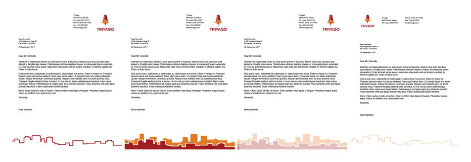
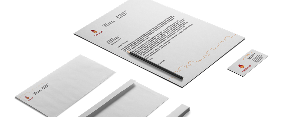
Secondary Identity Design

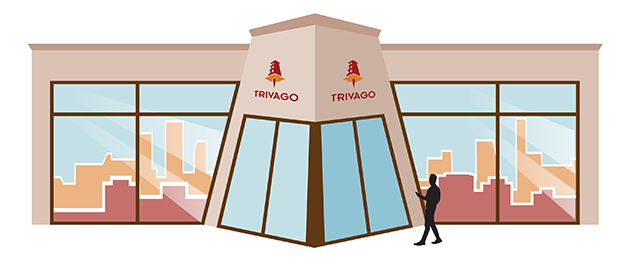
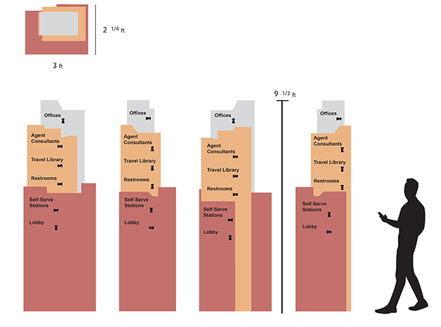
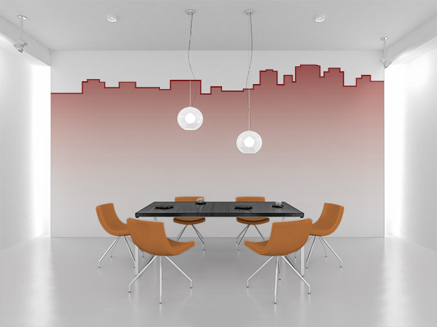
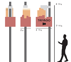
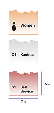
Environment and Signage Design
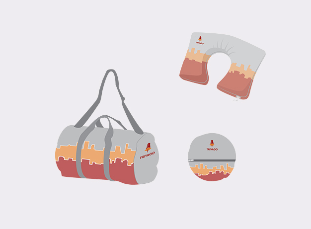
Promotional Item Design
Promotional Animation
"soaring" by urmymuse
2016 - Licensed under Creative Commons Attribution Noncommercial (3.0)
